To celebrate ONE MONTH until the release for “Don’t Dance with Death,” I thought I’d share the official cover and details on how it came to be!
As the finale of my Haunted Romance trilogy, the cover of “Don’t Dance with Death” went through the fewest iterations. It largely depended on the first and second books to make it a clear trilogy for the average scroller who’s judging my books based on their covers.
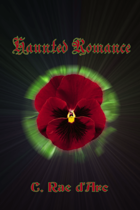
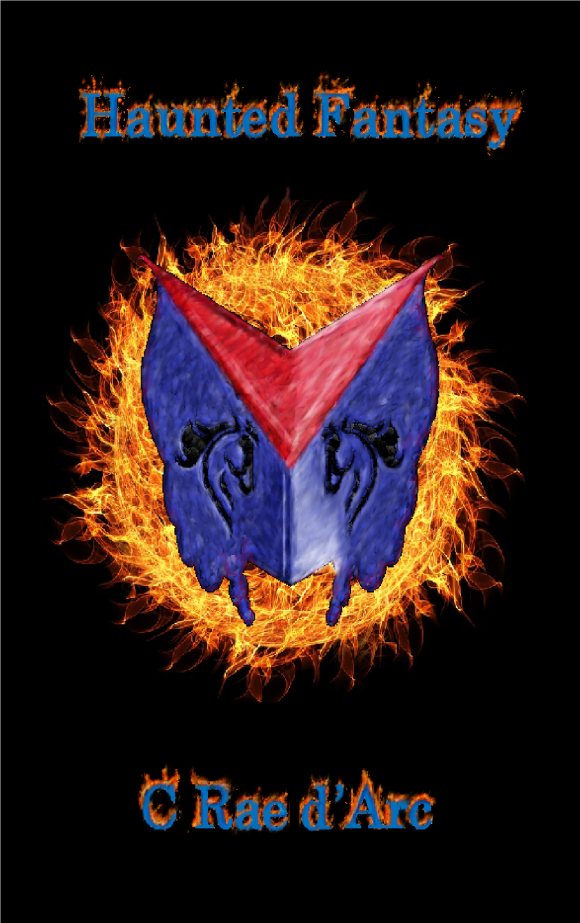
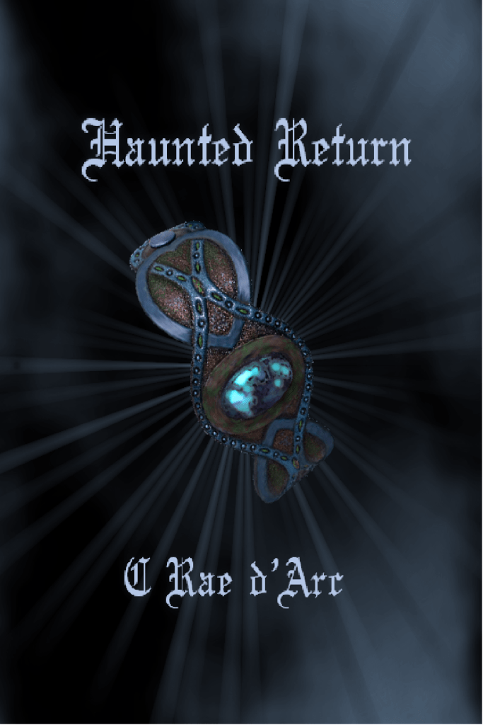
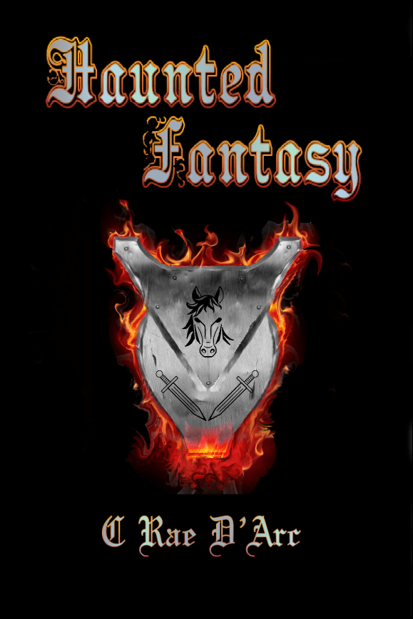
Back when “Don’t Date the Haunted” was terribly titled “Haunted Romance” (more about that here) and “Don’t Marry the Cursed” was “Haunted Adventure” (more about that here), book 3 was titled “Haunted Return.”
Each book focuses on a different character. Book 1 is Pansy’s book, book 2 is primarily Theo’s book, and (even though some of my alpha readers disagree) book 3 is Aeron’s book. I originally wanted a black background with a simple symbol to represent each character. So, book 1 was a pansy flower and blue-green aura, book 2 was a shield on fire, and . . . book 3 was a leather bracelet and smoke.
After I seriously considered creating my own covers…


Then I learned about the legibility of fonts…


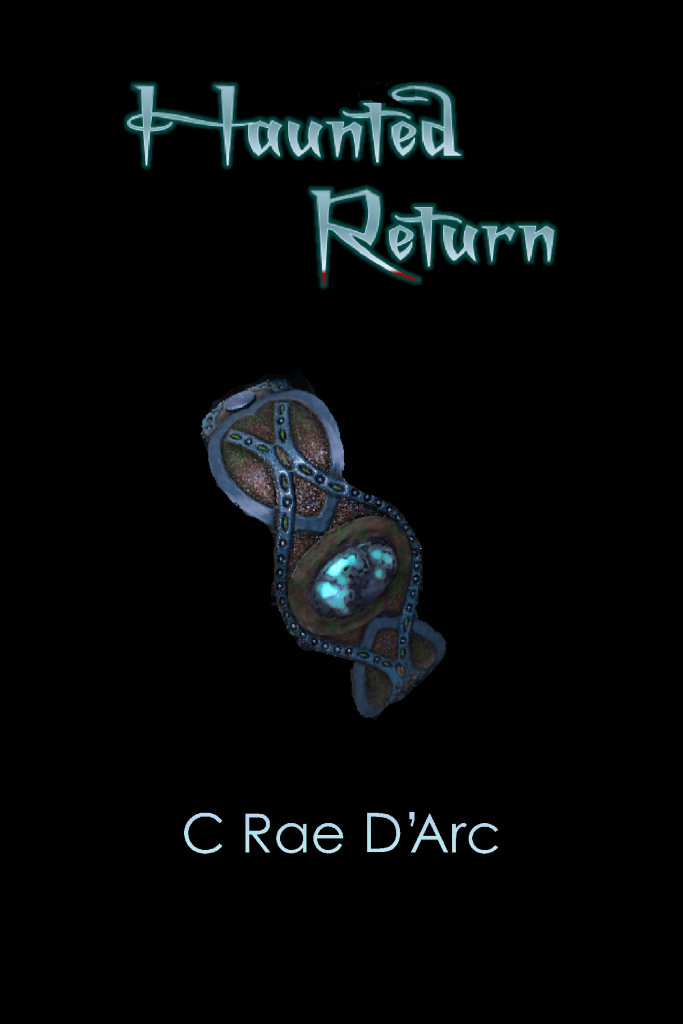
As you’ll see, the main differences between each of these versions was the fonts. The third version of the third book had smoke and spokes like the first two, but wasn’t saved with the original file.
The first time I talked with Shaela Odd from Blue Water Books, she suggested a woman’s smirk for book 1. This directed me toward the idea of a man’s eyes overlooking a shield for book 2 and a child’s arm reaching toward the reader, wearing a leather bracelet for book 3.
I didn’t consider this idea long enough to create a mock copy.
When the idea of silhouettes and items behind their backs came along, I created Pansy, then Theo…then really struggled for Aeron. Apparently, I can’t draw kids even with the help of clip-art.
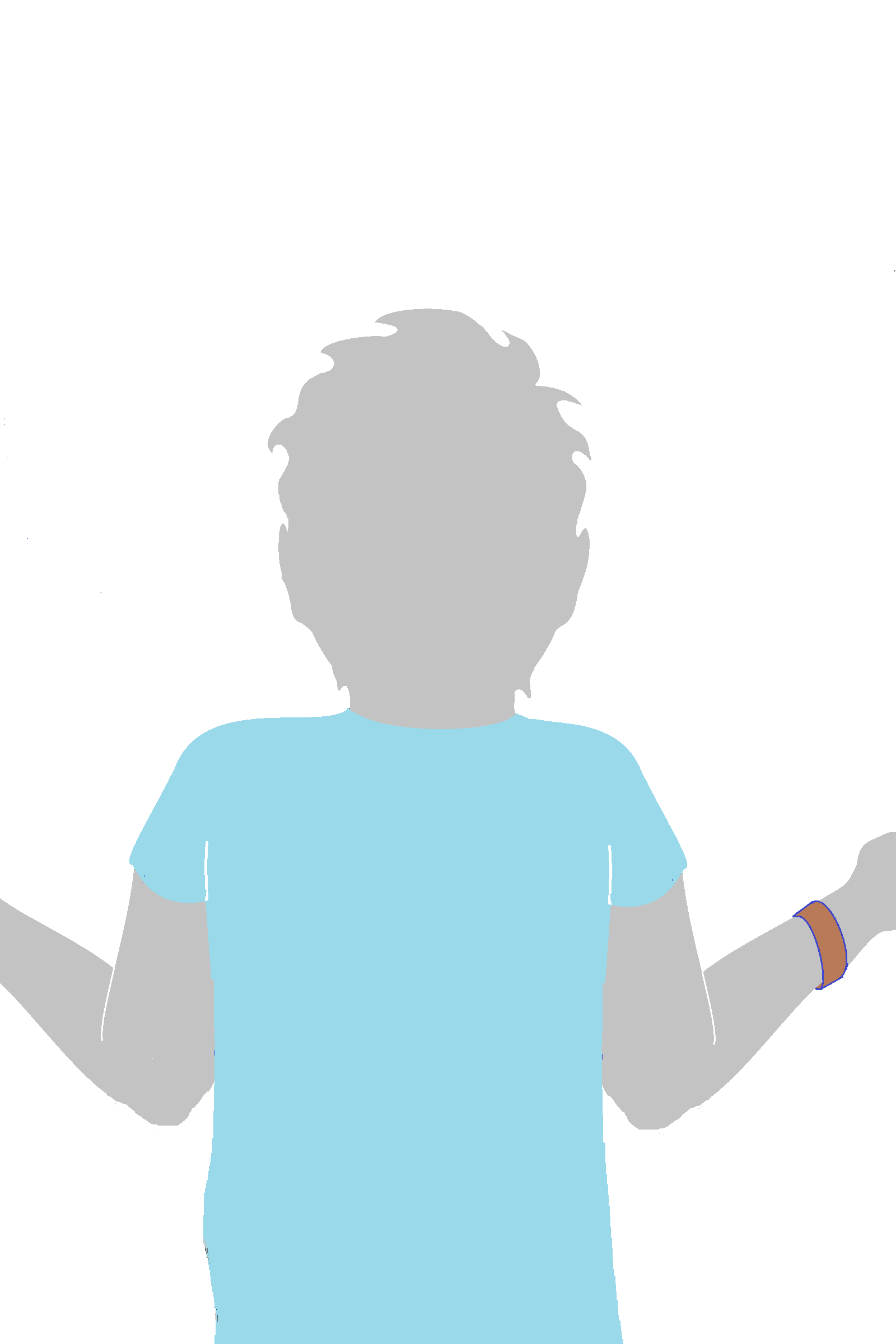
Oh man, I still cringe at the sight of my first attempt. I sent it to Shaela saying, “[This] is my failed attempt to outline the back of a 5 year-old boy (apparently, I can’t draw kids) wearing a leather bracelet and reaching up (as if holding hands between the silhouettes of Book 1 and 2).” Thankfully, I had a month to rework it and send her a couple different options.


The first one was a direct outline of a photo of a kid holding hands between parents. But he was facing the wrong direction, and I really wanted to include his leather bracelet, so I did a mock-up of him hiding it behind his back.
Shaela went with picture 3 and created THIS >>
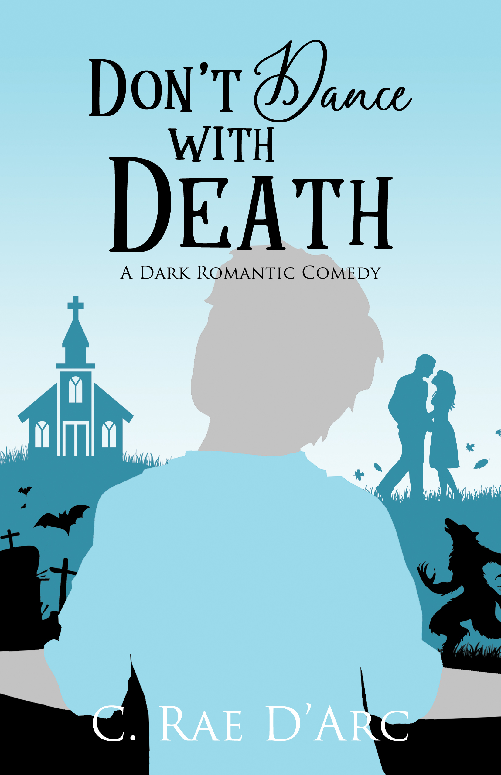
I L-L-L-LOVE IT! ❤
So, book 1 is mostly set in Romance, book 2 is mostly set in Fantasy…can you guess where book 3 takes place?
Highlight for Answer>>Pansy and Theo must rescue their son in HORROR! <<
For those who normally shun the genre, don’t worry. There’s still plenty of romance and humor to label it a Dark Romantic Comedy. This book is my way of proving that it’s not all blood and gore or violent sex (gross). There are some truly spiritual, stirring, and deep philosophical books in this genre. It’s also known for having a lot of light humor to combat the darkness.
And believe me, Theo’s perspective of this land sets me into giggles.
Anyway, I could go on about the misjudgments of genre, but for this post, here’s the climax:
Look! They’re holding hands! 😍

I love that this arrangement makes Pansy look at Theo, Theo looks at Aeron, and Aeron’s looking back to Pansy. 😀 ❤

Leave a comment